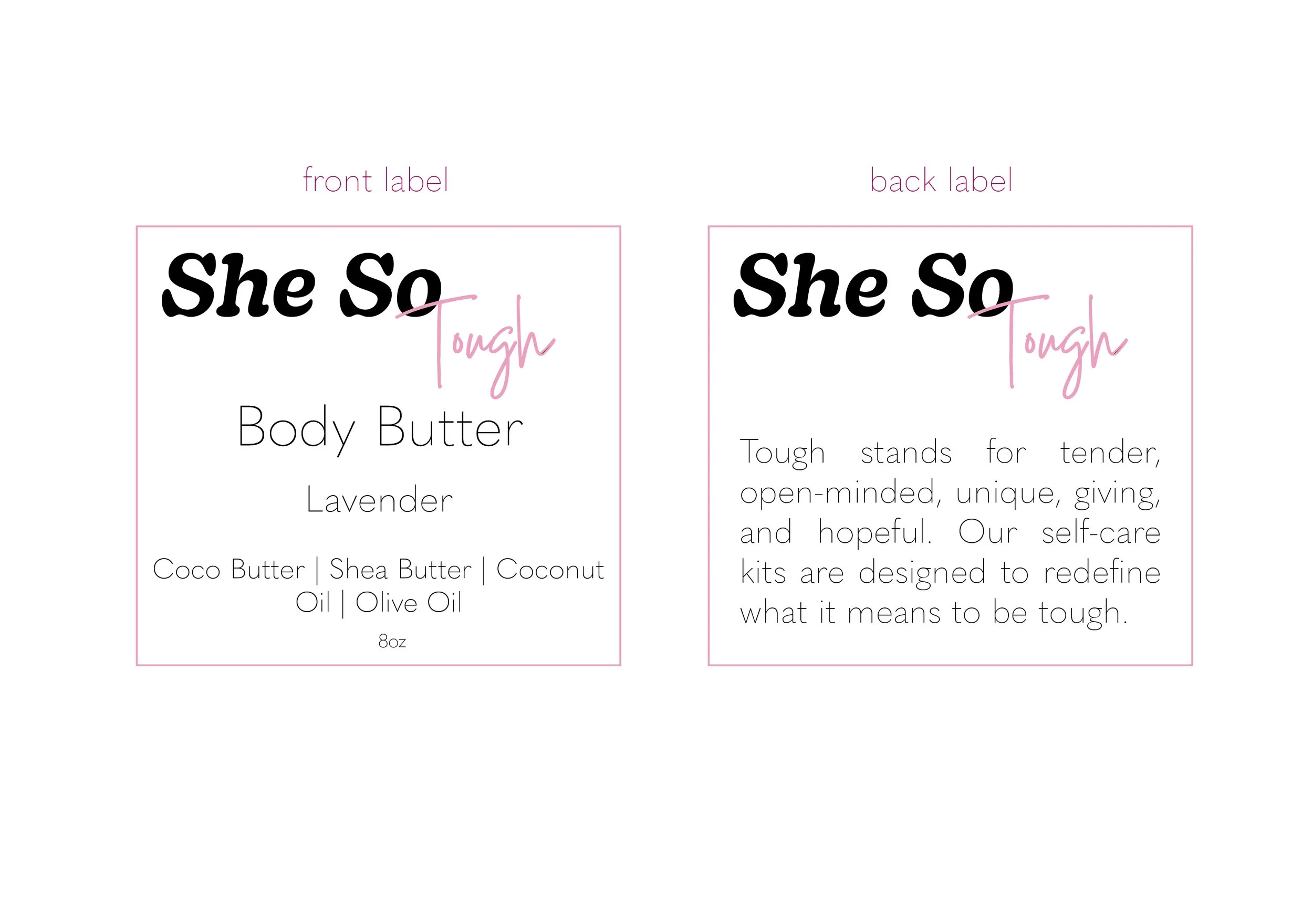
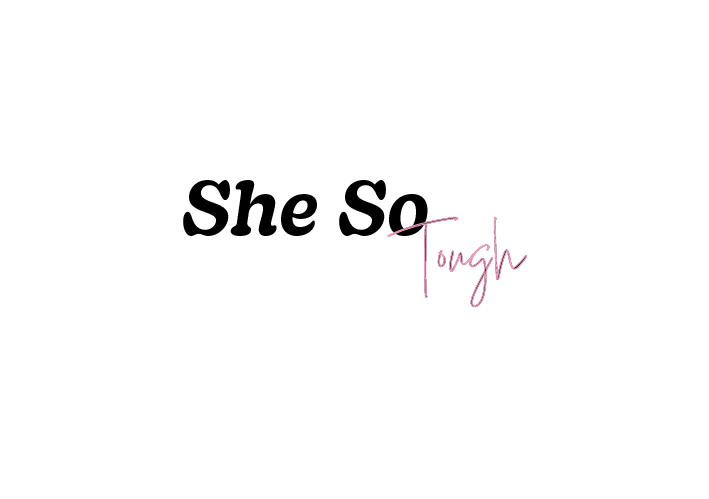
Click the image above for the first draft logo.
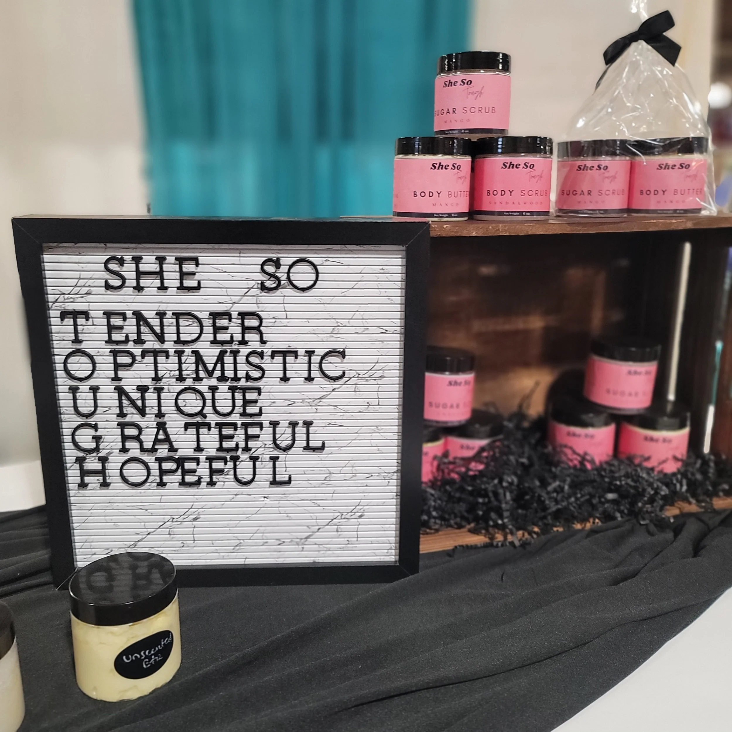
This brand design went through multiple iterations. Starting off as a skincare/selfcare brand for female veterans and veteran wives, it evolved into a brand focused on helping all women slow down and take care of themselves. Tough was an acronym representing a duality that most women struggle with: in this world you have to be tough, but tough does not have to be hard. Tough is not hard or rough but tender, optimistic, unique, grateful, and hopeful.
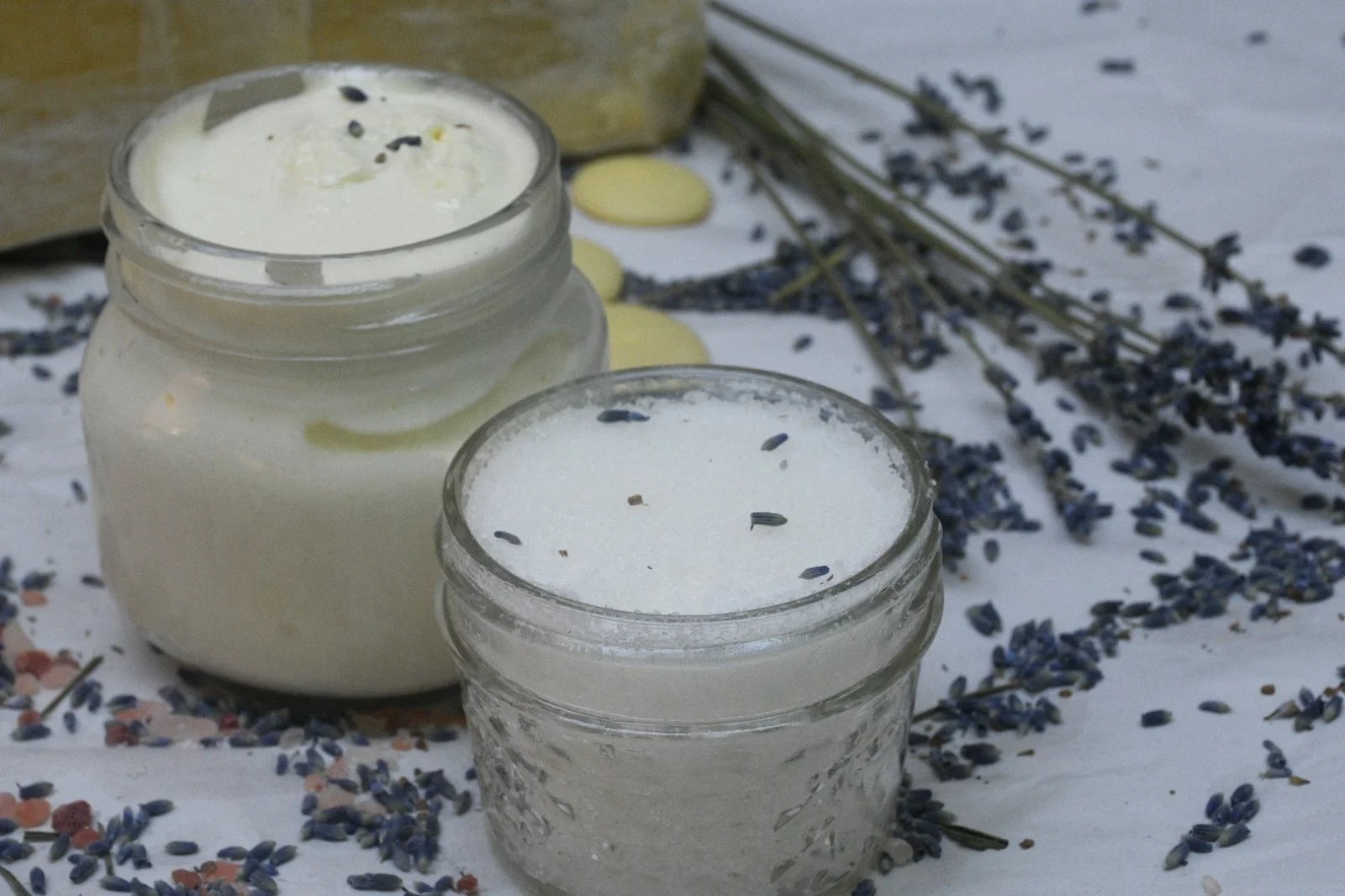
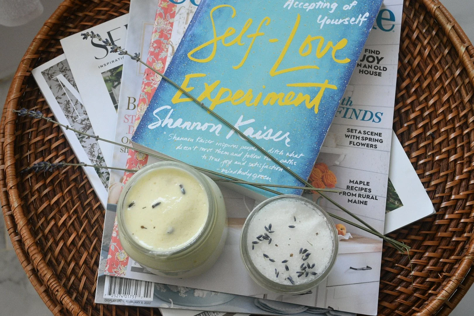
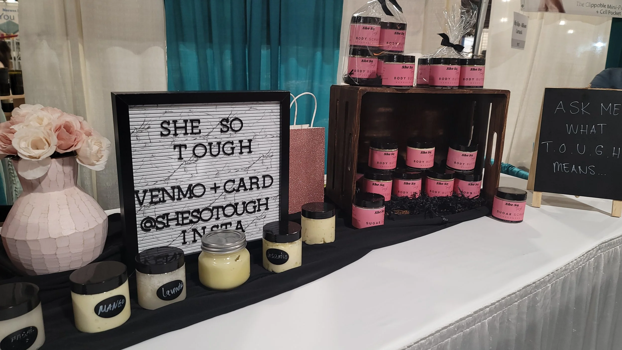
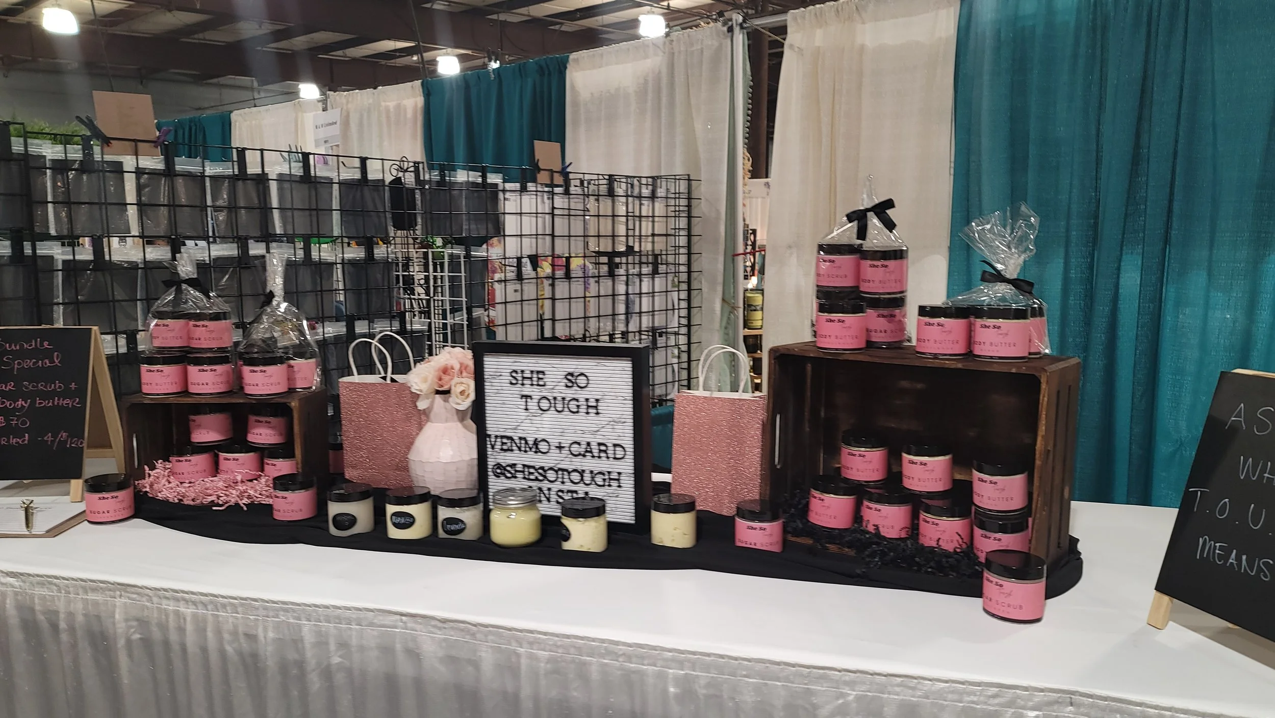
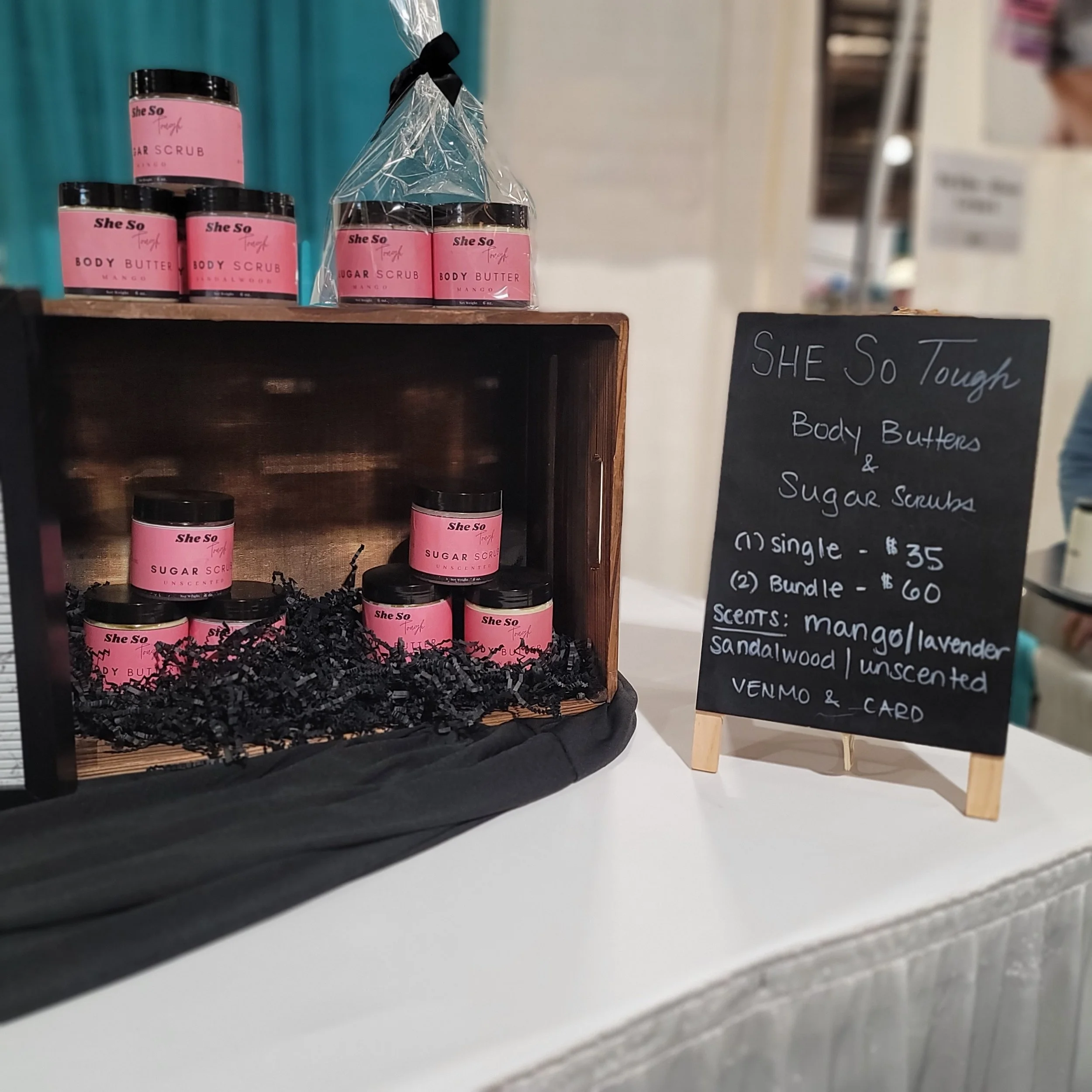
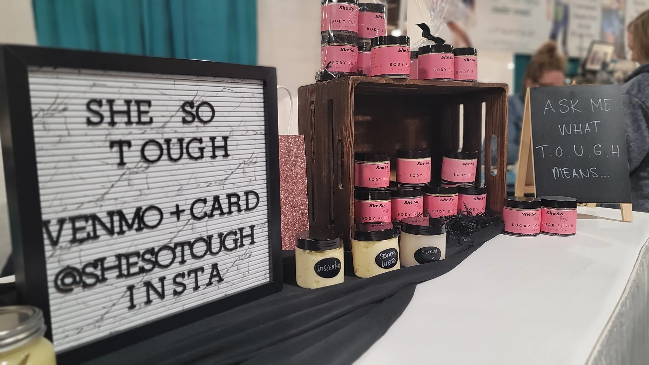
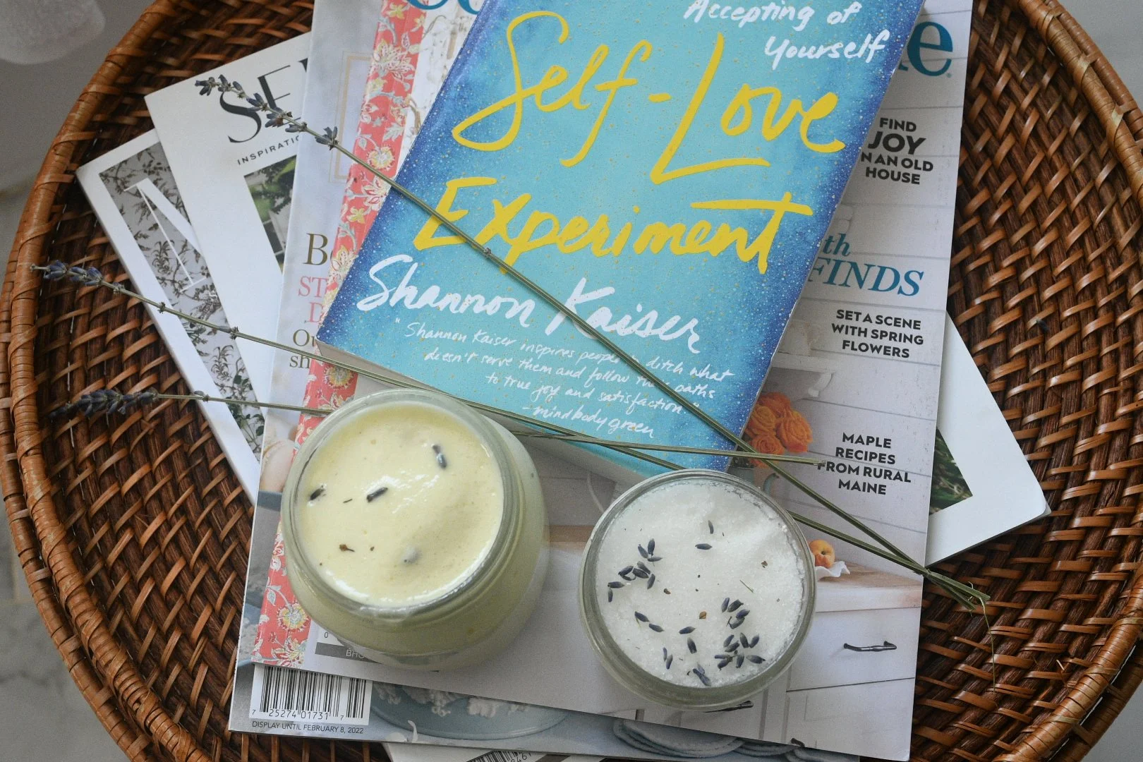
This client received a suite of services including logo, product labels and photography, strategy, and event booth set up and support.